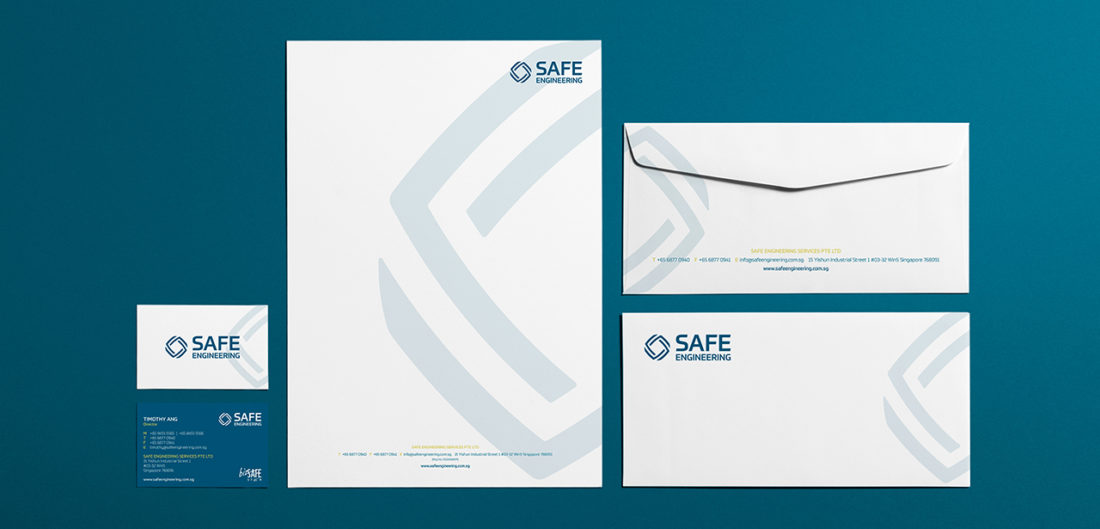
SAFE ENGINEERING
BACKGROUND
Safe engineering is a specialised installer for security systems looking to review its current positioning to remain relevant to its target audience. Their goal was to appeal to new customers.
STRATEGY
Through customers insights, Piquant helped Safe identify their strengths and areas for improvements in comparison to their competitors to evaluate their key differentiators.
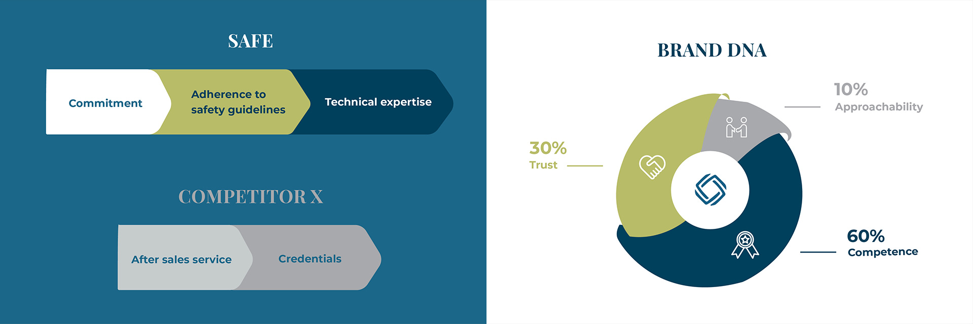
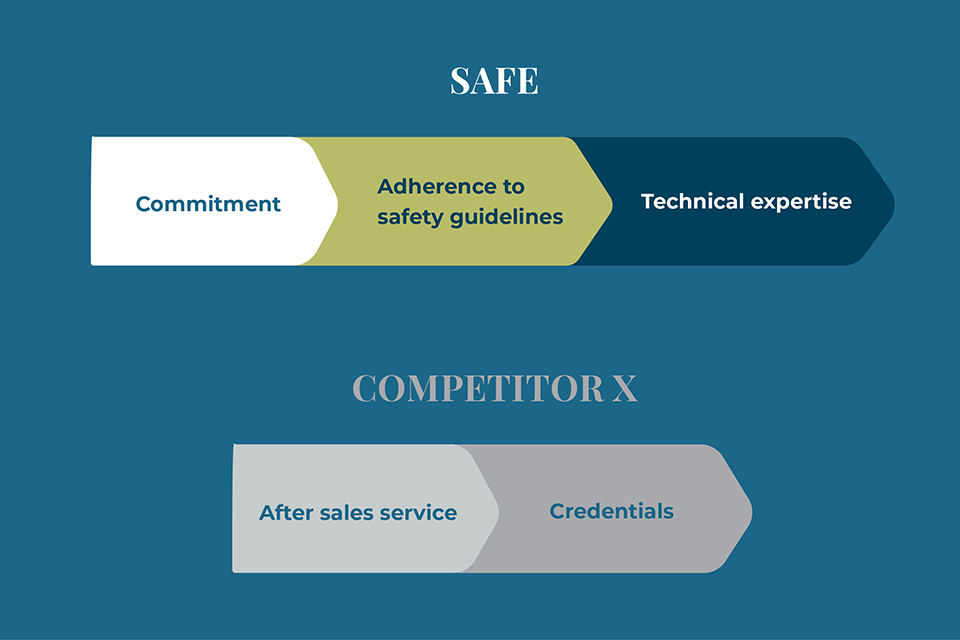
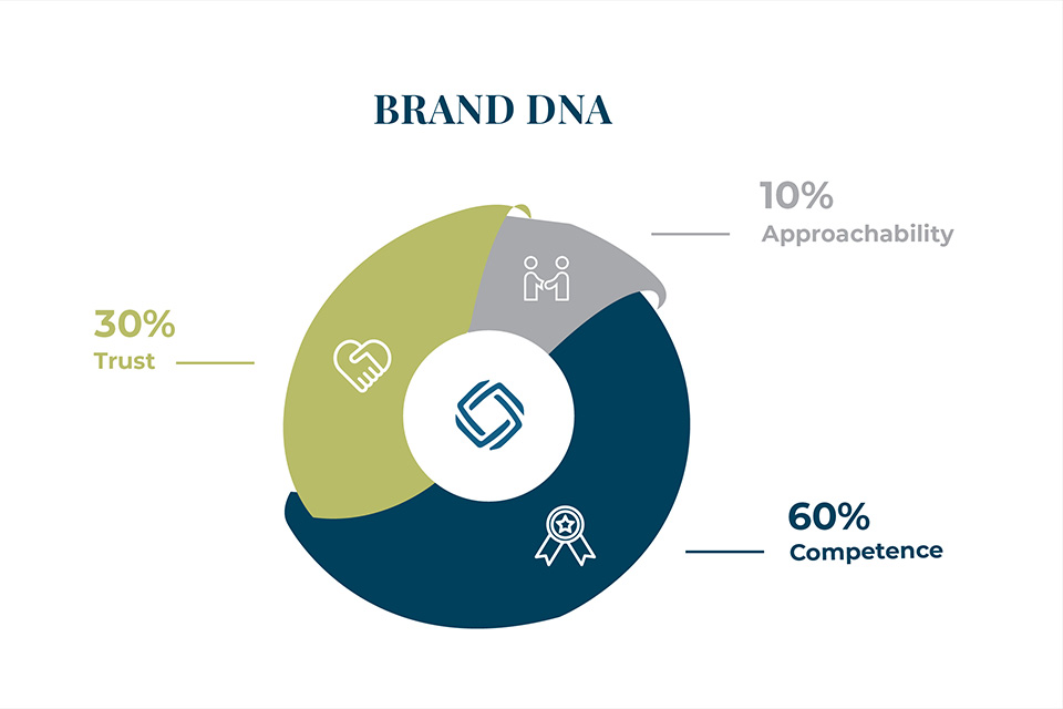
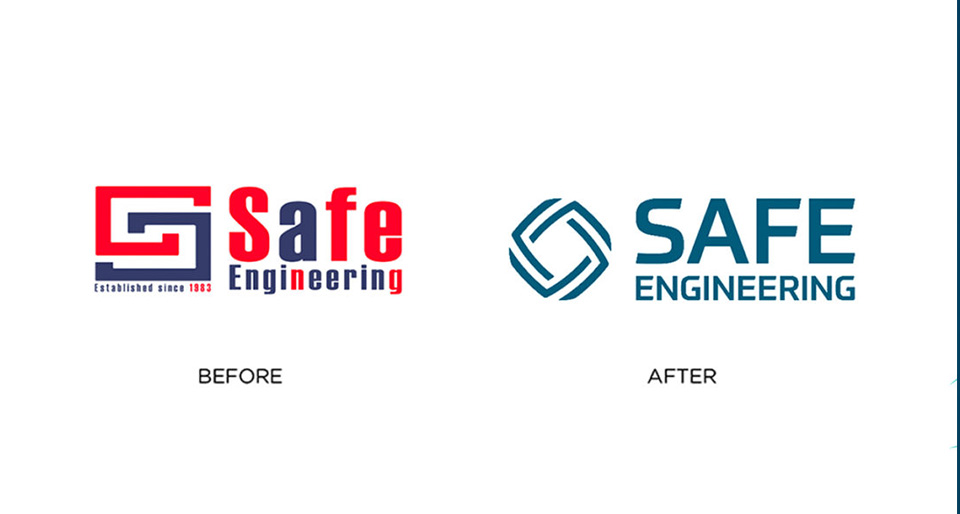
As such, Piquant crafted the key USP which translated to the conceptualisation of the logo,
representing quality, trust and sincerity.
IDENTITY
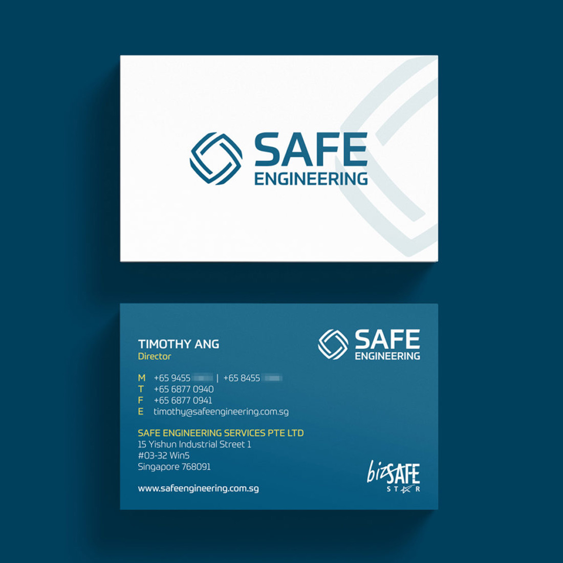
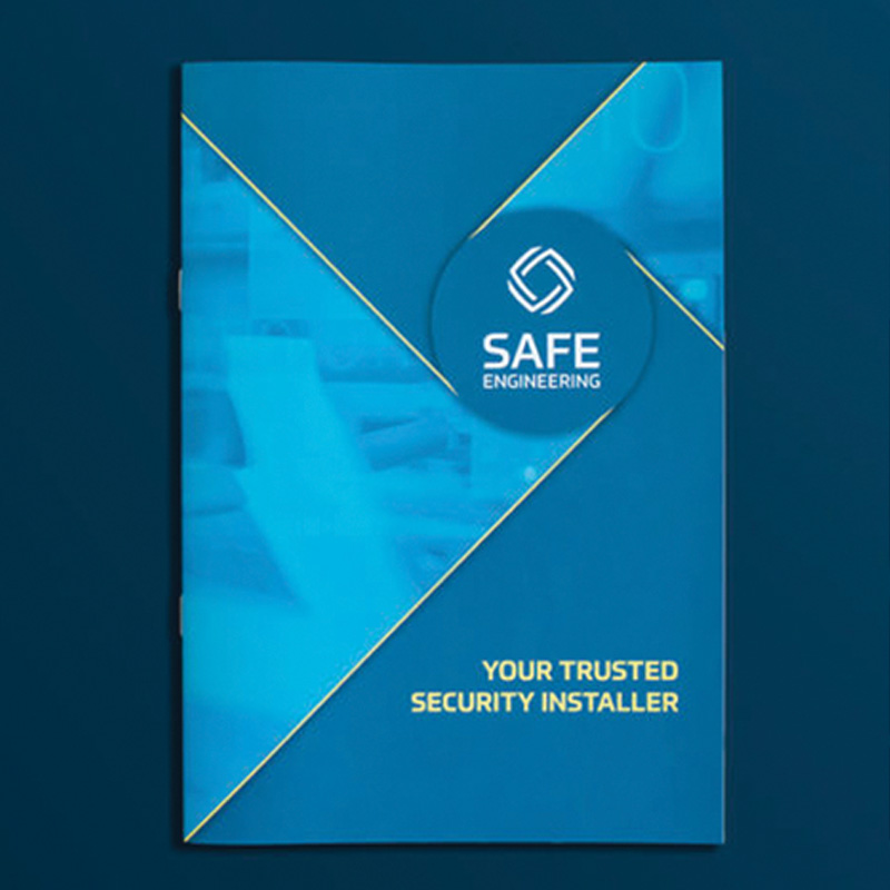
A diamond shaped logo with dynamic lines represents quality, further illustrating its brand promise, while the lines portrayed SAFE’s values(sincere, accountable, friendly and efficient). A modern font style illustrates the brand mission of building a progressive internal culture. With the colours blue evoking a sense of security and trust in the brand.
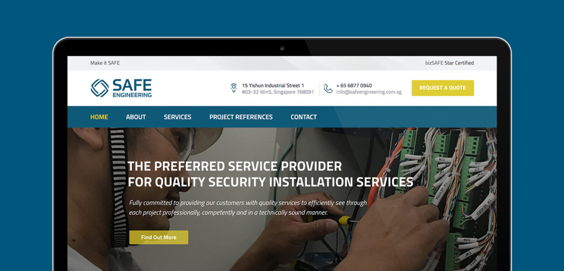
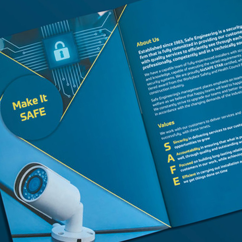
Along with that, the brand’s messaging also played an essential role emphasizing on the brand being approachable, professional, competent and accomplished. The refreshed brand identity followed through on the namecards, corporate stationary, employee t-shirts, vehical decals and not forgetting digitally as well.

OUTCOME
As a whole, this increased brand awareness and digital presence for Safe Engineering, showcasing its offerings and capabilities through collaterals and a digital platfrom that resonates better.


