An initiative between Maritime Port Authority and National University of Singapore, Pier 71 is an accelerator program that promotes Maritime Innovation.
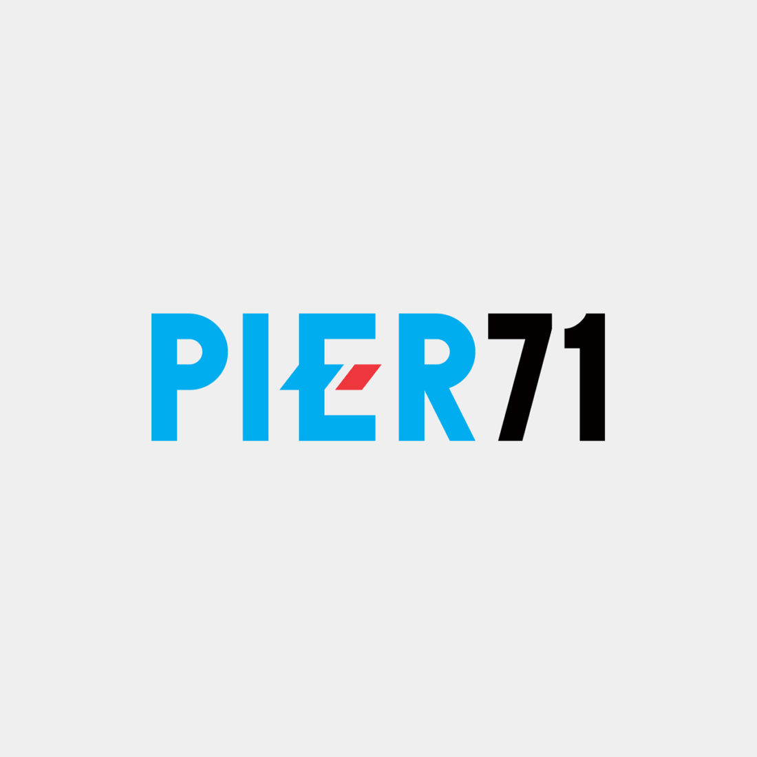
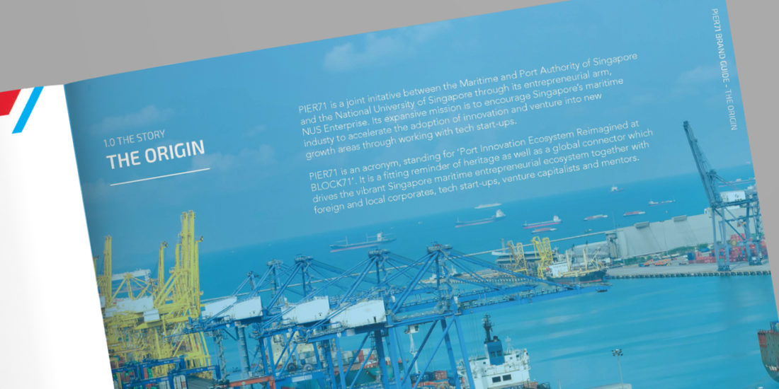
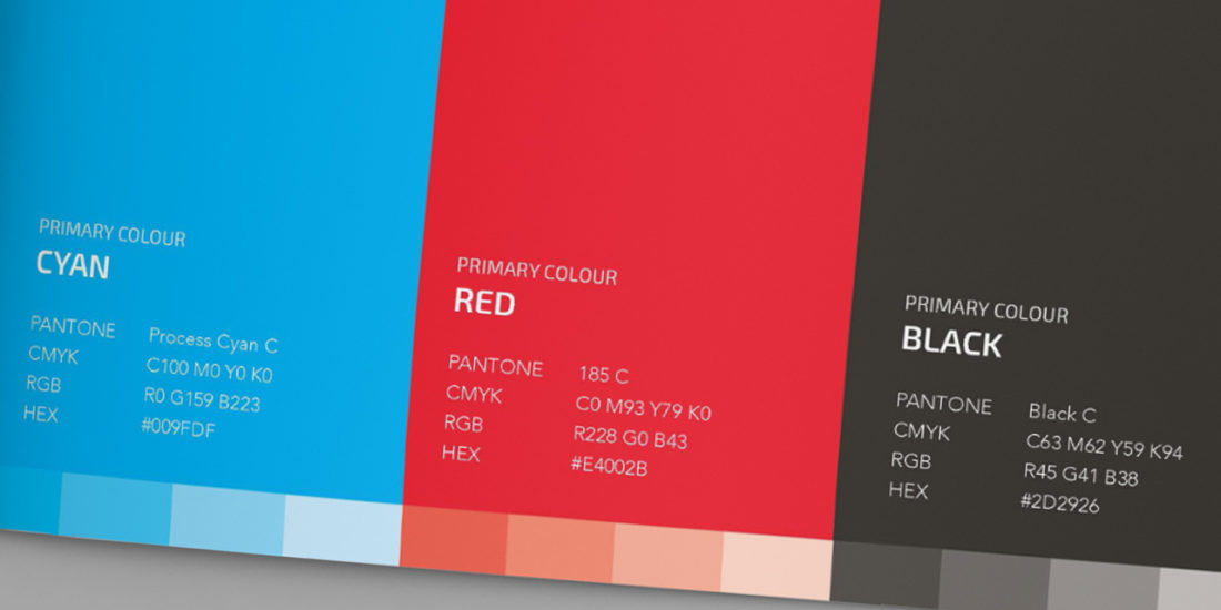
Naming was the first phase of the project where we envisage for this industry to be “reimagined”. Pier 71 is the acronym for “Port Innovation Ecosystem Reimagined at BLOCK71”. The logo was inspired by the shape of the compass arrow to represent the action of propelling forward to the future, and the colour red to represent Singapore as the global leader in the maritime field.
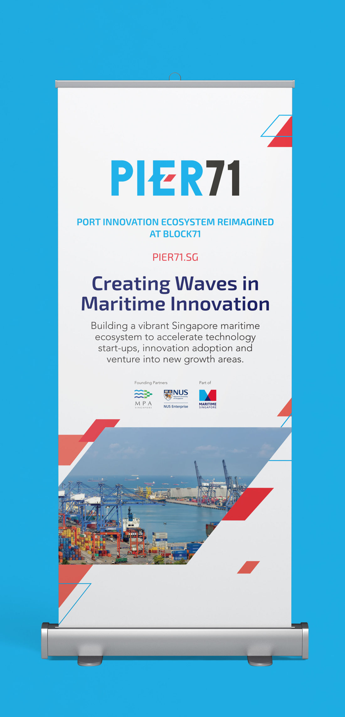
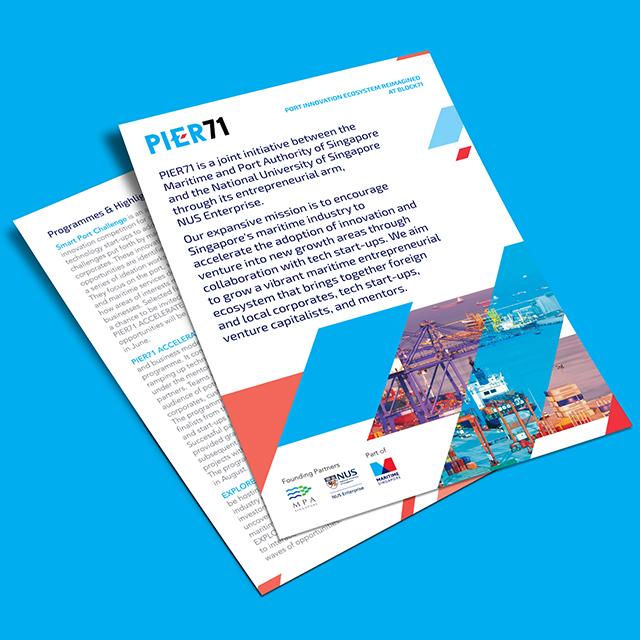
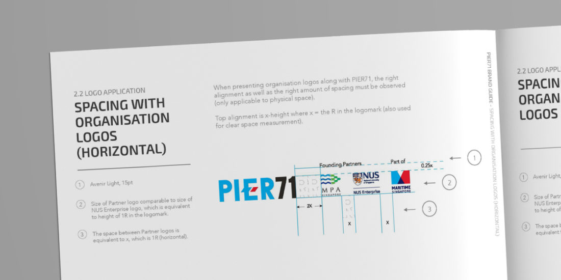
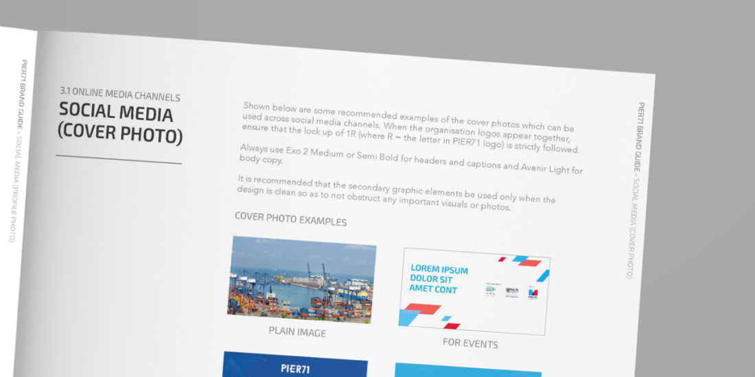
The client successfully launched the program, and created a series of collaterals that was in line with the brand concept and brand guide that Piquant crafted.


