FAMIBIOTICS
BACKGROUND
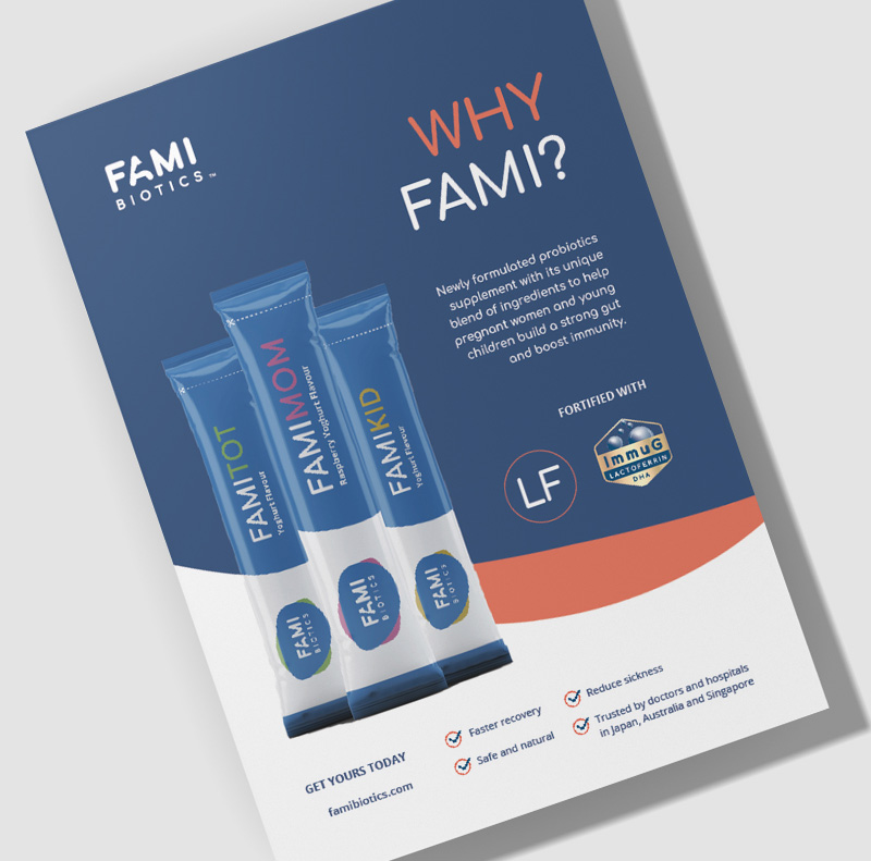
Newly formulated probiotics supplement with its unique blend of ingredients to help pregnant women and young children build a strong gut and boost immunity.
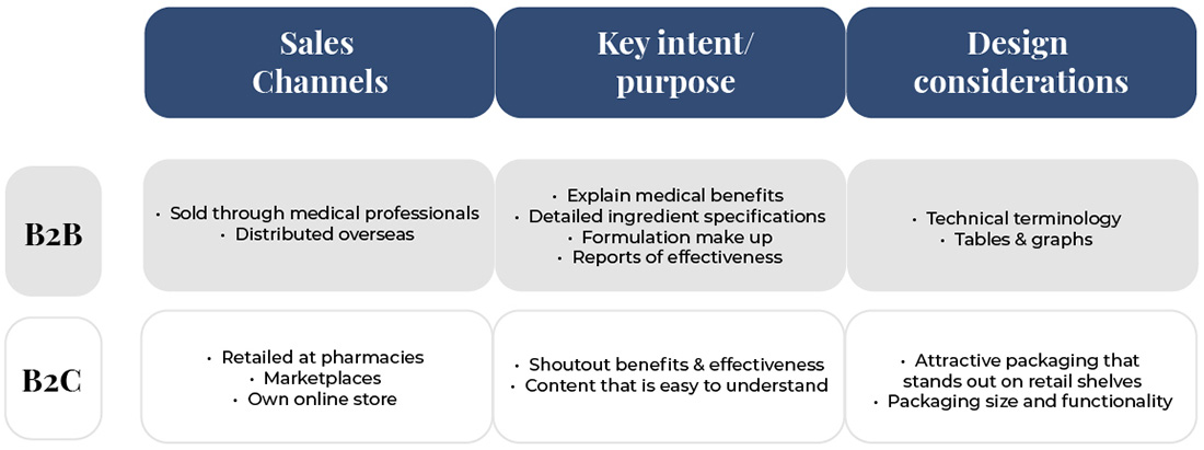
The intention of its sales channels is at clinics and eventually to pharmacies thus we had to craft a brand that would appeal to customers through the various sales channels.
Famibiotics intend to target working mothers who have busy schedules and still want the best for their child’s growing years. Thus we wanted to bring out the ease of use and high nutritional benefits of Famibiotics.

STRATEGY
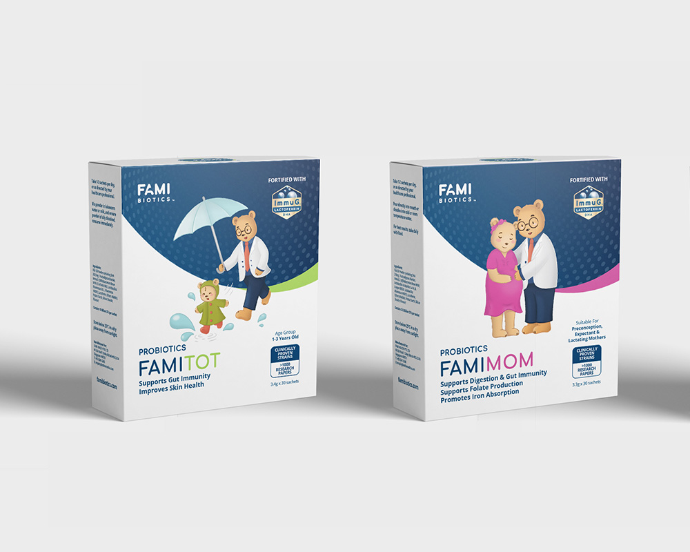
Brand personification was a strategy that we thought could bring together the core values and differentiators of the product and business. As well as would work for the intended sales channels.
We wanted the brand to be portrayed as being best-in-class, modern, trusted and approachable.
STRATEGY
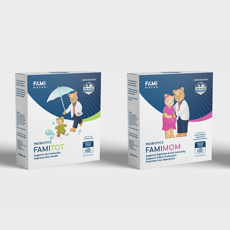
Brand personification was a strategy that we thought could bring together the core values and differentiators of the product and business. As well as would work for the intended sales channels.
We wanted the brand to be portrayed as being best-in-class, modern, trusted and approachable.
IDENTITY
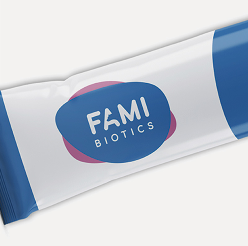
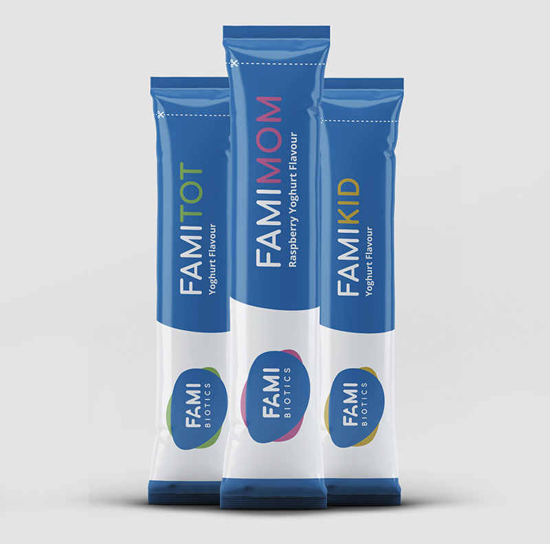
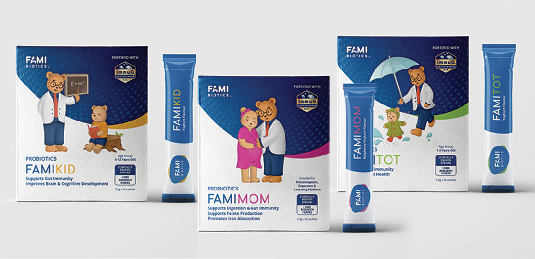
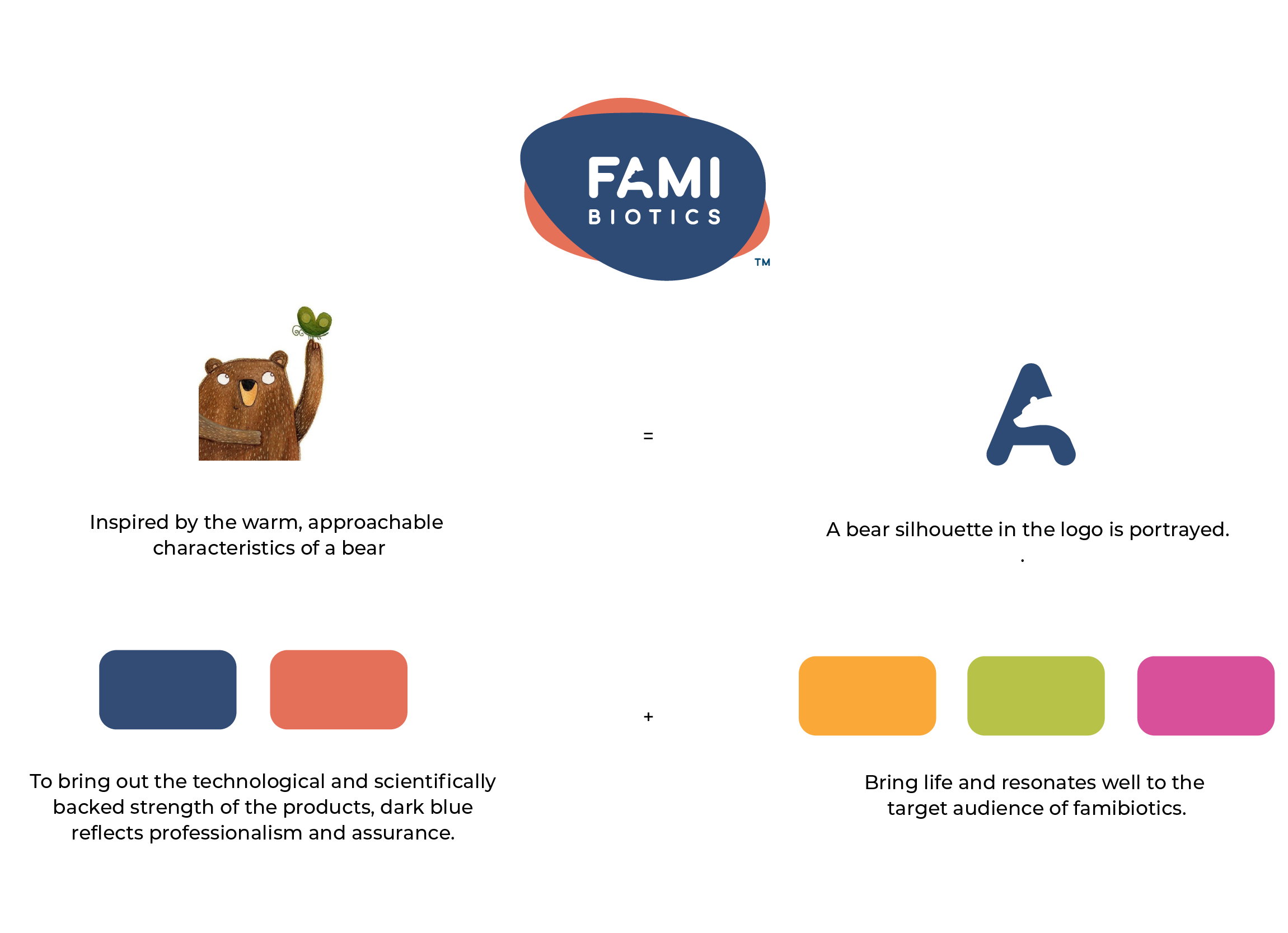
Inspired by the warm, approachable characteristics of a bear. A family of bear characters were custom illustrated for Famibiotics. Including a bear silhouette in the logo. To bring out the technological and scientifically backed strength of the products, we chose dark blue as the primary colour that reflects professionalism and assurance. With brighter supporting colours that bring life.
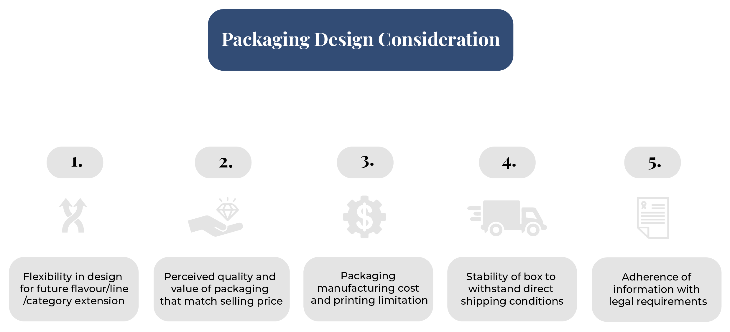
On top of having attractive graphics, the content hierarchy on the packaging also plays a part. As consumers need information to evaluate product suitability, we believe in helping clients strategise the content necessary that aids in the conversion of customers.
OUTCOME
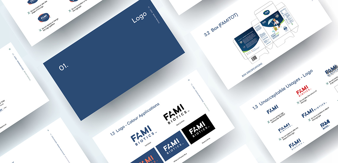
Our internal packaging test with profile contacts received good feedback. The first perception that target audience looking at the product was in line with the client’s ideals.


