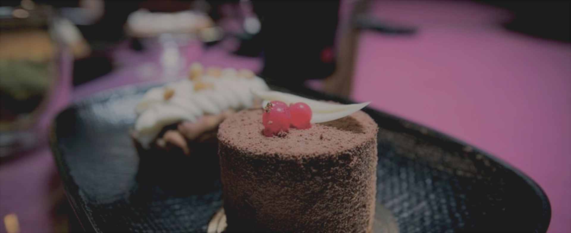
DUXTON 41
BACKGROUND
Founded by a pair of fitness enthusiasts who not only had the passion for baking but was determined to encourage indulgence in a clean and nutritious manner.

STRATEGY
A brand built from scratch, the founders were ambitious and had the drive to start up a cafe that were filled with only healthy treats for a guilt-free indulgence. Its name came about from its hype and attractive location at Duxton, and its main target audience is highly affluent individuals, cafe goers and fitness enthusiasts.

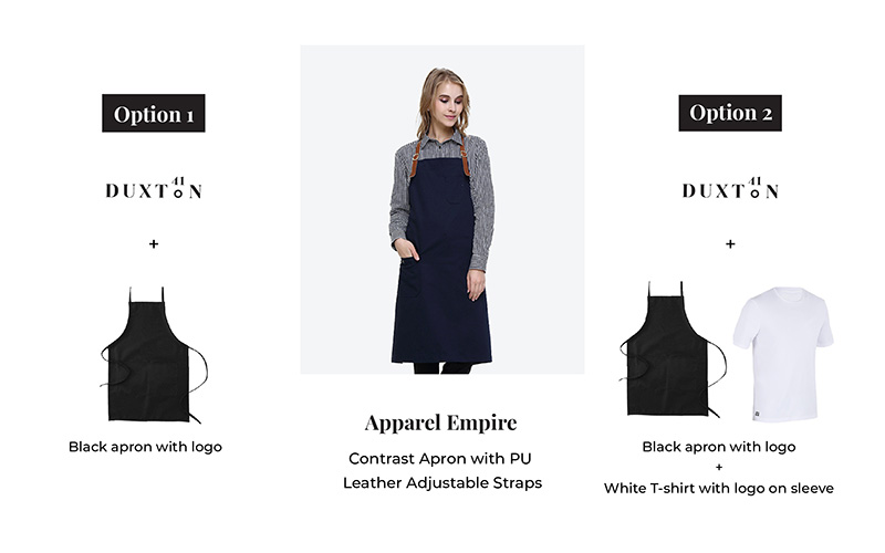

As it was an innovative concept and with many obsessed with healthy eating and keeping fit, we positioned Duxton 41 as a destination-driven cafe, one that builds meaningful memories and more than just a cafe.
IDENTITY
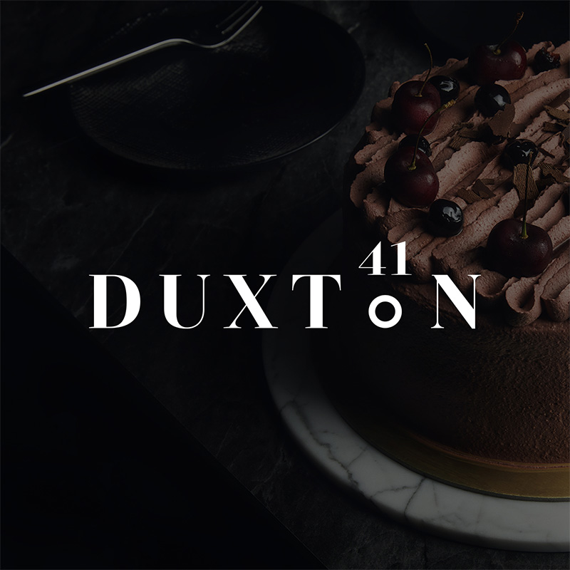
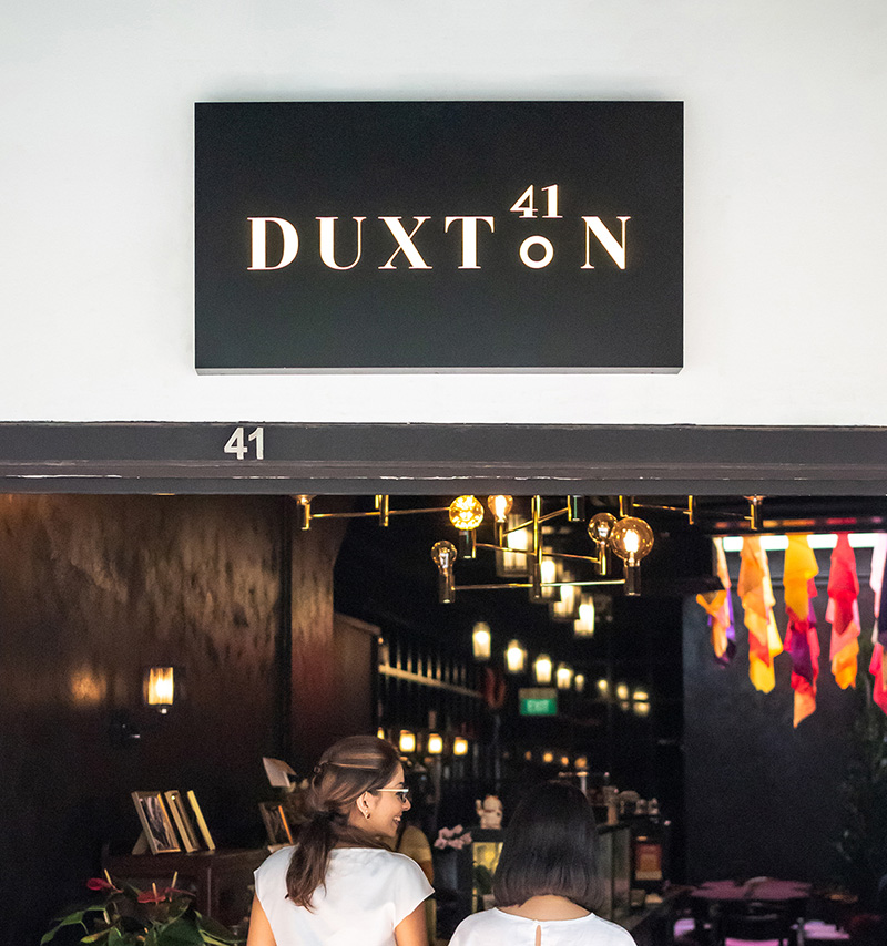
If Duxton 41 was a person, he would be sophisticated, modern and distinct. With the idea of the place to be, the logo inspired by the location pin. It was crafted with serif font with sharper edges, to give a contemporary, luxe vibe. Both the letter ‘O’ and number ‘41’, further emphasises the cafe as a stand out location.
A monochrome palette was adopted to symbolise dignified, sophisticated lifestyle, lending to the cafe’s overall ambience. Along with its unique boutique of multi-hued thai silk fabric, added a vibrant colour to the monochrome palette.
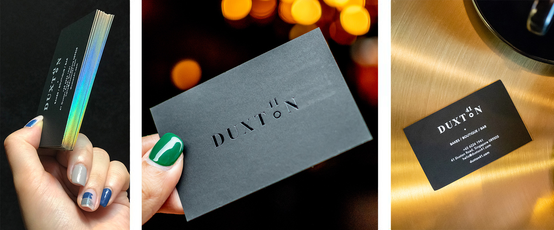
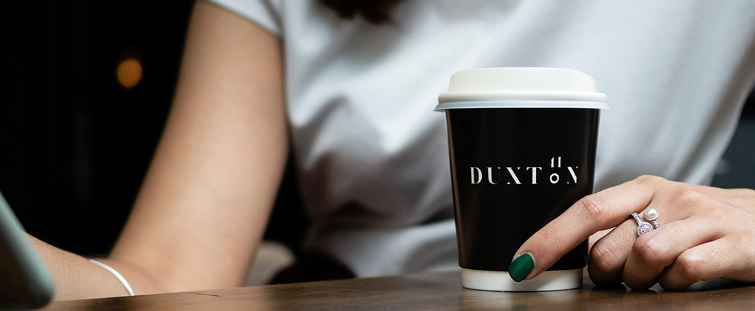
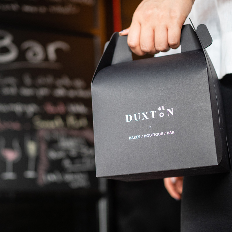
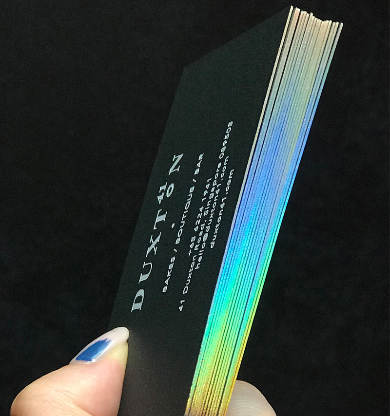
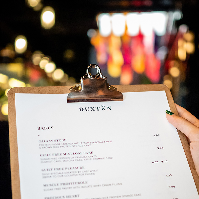
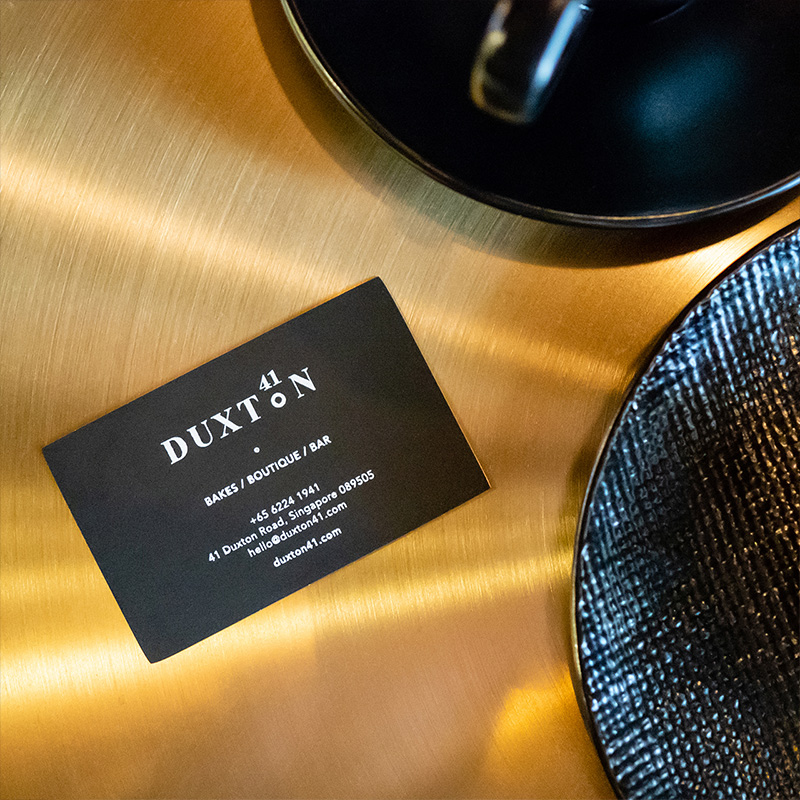
Duxton 41 is all about a myriad of sensorial experiences, great conversations, guilt-free treats and thai silk fabric. With that, we crafted the corporate collaterals, packaging boxes, photography to match up to the persona.
OUTCOME
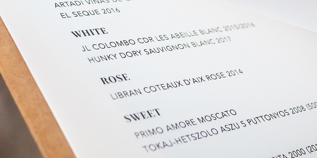
From brand logo, packaging, website mockups, website creation, menus, photography art direction coordination to their collaterals and launch invites, Piquant brought the client through a seamless phase of conceptualising, production and launching of the new brand.


